

VISUAL DESIGN GUIDELINES
Brand Fundamentals
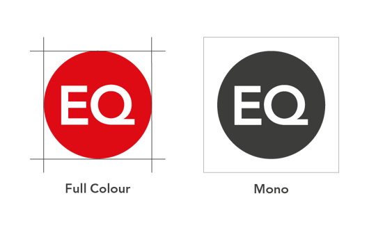
The EQ Dot
Our logo is where it all begins, it’s the heart of our visual identity. EQ embodies the simplicity of our operations, the quality of service, and our move to digital-first.
Typography
Our typeface is Avenir LT Pro, an extensive typeface with variety of family weights. It is a modern and confident typeface, suitable for both headlines and text. Our system font is Calibri, for more information on typography please click the link below.

Colour
Our new colour palette features colour groups. Primary, hero, and secondary with some additional colours to be used digitally and within campaigns.
We've created example colour combinations to be used when creating assets to ensure there is a good balance of colour.
EQ Signature Red

Red
PMS 185 C
C0/M97/Y100/K0
R222/G10/B20
#DE0A14
Please do not use tints of the red
EQ Body Text Black Grey

Black Grey
PMS Black 7 C
C0/M0/Y0/K90
R60/G60/B59
#343534
Primary Colours

Insightful Blue
PMS 2736 C
C97/M95/Y0/K0
R53/G46/B135
#352E87

Expert Digital Blue
C71/M53/Y0/K0
R92/G127/B255
#5B7FFF

Insightful Digital Purple
C71/M76/Y0/K0
R107/G64/B232
#6C40E8

Growth Green
C68/M0/Y45/K0
R43/G199/B168
#2BC7A8
Secondary Colours

Green Blue
C79/M26/Y36/K8
R37/G137/B150
#258996

Digital Lilac
C53/M57/Y0/K0
R155/G119/B255
#9B77FF

Digital Cyan Blue
C57/M0/Y7/K0
R80/G191/B218
#50C0DA
Highlight Colours

Campaign Red
C0/M84/Y58/K0
R239/G10/B69
#EF0A45

Expert Bright Blue
To be used for web only
R41/G59/B220
#293BDC
Core & Tonal Neutrals

Expert Blue
C100/M96/Y38/38
R28/G31/B76
#1C1F4C
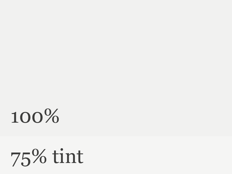
Pale Stone
C7/M4/Y6/K0
R241/G241/B240
#F1F1F0
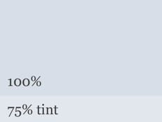
Sky Blue
C18/M10/Y7/K0
R216/G222/B231
#D8DEE7
Photography And Imagery
One of the best ways to represent EQ and what it stands for is through the people who work for us and the people who use our services. We also use gradients and graphics which are used to represent things that are a little harder to portray such as regulation or changes in economic landscapes.