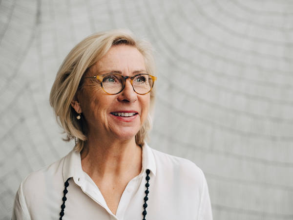
One of the best ways to represent EQ and what it stands for is through the people who work for us and the people who use our services. We also use gradients and graphics which are used to represent things that are a little harder to portray such as regulation or changes in economic landscapes.

Photography And Imagery
People – Reportage
This focuses on the person or a number of people, it should document experiences and interactions in our environments, other business settings or lifestyle settings. The shot should tell a story and capture a moment in time.
- Tell a story – movements and moments in time
- Reflect our world-wide workforce
- Reflect our personality and values
- Capture people experiencing interactions, emotions and authenticity
- Reflect the chemistry between colleagues, clients and friends
- Capture real life in an uncontrived way
People – Portraiture
This captures individuals in a more professional stance and are used for channels such as Equiniti.com or social media. This concentrates on faces and should reflect personalities. Either capture this shot on a neutral background with the person wearing neutral, muted colours and limited patterns, or preferably, capture them in the reportage style, described above, where you capture them in the moment and create a close crop of the overall image.
- Capture the person in a space/environment reflective of what they do where possible
- Show more than just head and shoulders, try to capture from the waist up
- They don’t always need to be looking at the camera
Technology
One of our key focuses is to represent our proprietary technology, we do this by using images of people who are deemed to be using these products. Vector mockups can also be used to show screenshots of our platforms.
Iconography
Our icons are an outlined object, symbol or action. Use these to represent subjects or as a meaningful extension of words. These are not to be used for decoration or filling space. The icons should always be a solid colour.
Icons are created by the brand team to a design formula, if you require an icon which isn’t represented on EQLightbox please request it by contacting the brand team.
Gradients
Our brand gradients are created using a blend of EQ colours. They are used as an alternative to imagery when a subject matter is difficult to portray and to increase type legibility.
Graphics
Our brand graphics are abstract illustrations created using simple shapes.
These are used to represent subject matters which are difficult to portray in an image. The graphic should feature no more than 4 brand colours.

